-
- Industry:
- Sports
-
- Client:
- Norwegian Football Federation (Norges Fotballforbund)
-
- Category:
- Brand Strategy
- Brand Architecture
- Brand Identity
The Norwegian national teams represent the best of Norwegian football, yet, each different national team has their own unique story: The women have revelled in glory by winning a World Cup. The men are currently competing in the World Cup Qualifiers, and are a young, talented team eager to prove themselves as a side not to be taken lightly. And the youth teams are performing well, holding up a bright light for the future of Norwegian football. The team crest on the player’s chest embodies the highest honour any player strives to achieves. This is encapsulated in the Norwegian expression «å spille med flagget på brystet», which translates into “play with the flag on your chest”.
Unsurprisingly communication of and around the national team had previously relied almost solely on the national flag and its colours. The Norwegian Football Federation came to us to change this. They wanted develop a stronger identity with more substance and personality that reflected the stories and players of the national teams.
Over recent years we had worked with NFF to establish three core values that would be expressed through everything that they did, even being adopted within the foundations of their training and game play philosophy and style - stolthet (pride), samhold (unity), and råskap (ruggedness). So, how could we use these values to tell the stories about the national teams? In what way could we make the values part of a bigger narrative around Norwegian football? How could we tap into established football territories such as pride and unity? And how could we tell stories that would express these values through victories, losses, and, why not? Even as world champions?
The national anthem is sung whenever the national team plays. So, we picked excerpts from its lyrics to attach to the national team's developing stories, and more widely into all of Norwegian football. The narrative devices we created stretch from every corner of a long and rugged country, reflecting the attitude and hardships that shapes the players. It tells the story of every young player’s dream of one day standing proud in an arena's tunnel, waiting to represent the national team – «med flagget på brystet.»
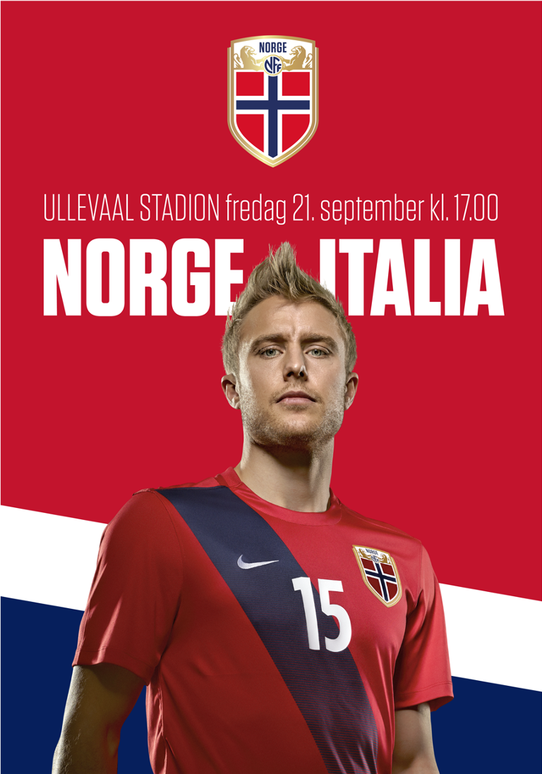
This feeling was carried into the crest by introducing new elements that went beyond the flag and into the very values that the national teams hold. The result is a crest that stands bold while providing substance and subtext to tell their stories.
Building on Norwegian football history and heritage, the new crest resurrects the lion and shield used in the 1910s and 20s. During this era, it was not only used on the crest, but also on other branded elements, such as caps, that honoured national players.
For communication and supporting collateral, both the women and men’s team were photographed in rugged and determined style, set against a backdrop of dramatic Norwegian landscapes. Together with typography and elements from the crest, it establishes a distinct visual and tonal narrative that sets them apart from the rest of the world.
We hope you join us in a passionate, loud and clear: Heia Norge! Heia Norge!
Branding legacy
The Norwegian national teams represent the best of Norwegian football, yet, each different national team has their own unique story: The women have revelled in glory by winning a World Cup. The men are currently competing in the World Cup Qualifiers, and are a young, talented team eager to prove themselves as a side not to be taken lightly. And the youth teams are performing well, holding up a bright light for the future of Norwegian football. The team crest on the player’s chest embodies the highest honour any player strives to achieves. This is encapsulated in the Norwegian expression «å spille med flagget på brystet», which translates into “play with the flag on your chest”.
Unsurprisingly communication of and around the national team had previously relied almost solely on the national flag and its colours. The Norwegian Football Federation came to us to change this. They wanted develop a stronger identity with more substance and personality that reflected the stories and players of the national teams.
- Brand Strategy
- Brand Architecture
- Brand Identity


Home court uniform
Opponent's court uniform


